Les articles publiés sur le site
-
Unwrapping Matomo 5.2.0 – Bringing you enhanced security and performance
25 décembre 2024, par Daniel Crough — Latest ReleasesAs we tie a bow on 2024, we’re delighted to share our final gift of the year. Matomo 5.2.0 comes wrapped with new security features, privacy controls, and performance improvements to enhance your analytics experience.
Enhanced security and privacy controls

We’ve strengthened Matomo’s security framework with several key updates:
- A new installer timestamp mechanism for on-premise installations creates a secure 72-hour installation window, preventing unauthorised access during setup
- Enhanced account security features including a “This Wasn’t Me” link in password reset emails and location-based login alerts
- The new Global List of Query URL parameters feature lets you refine tracking by excluding sensitive or unnecessary parameters from collection
Tag manager improvements for better efficiency

The Matomo Tag Manager now includes several features to streamline your workflow:
- New Consent Management Platform (CMP) tags for CookieYes, OneTrust, and Axeptio, simplifying consent tracking implementatio.
- A new copy feature for containers, tags, and triggers that reduces setup time and ensures consistency across multiple properties
- Improved management tools for maintaining standardised tracking across websites
Performance and reliability updates
We’ve made technical improvements to enhance Matomo’s performance:
- Full PHP 8.4 compatibility for improved performance and reliability
- Optimised archiving processes including smarter handling of recent data
- New recovery options for interrupted archiving processes
- Specific improvements for TiDB compatibility, enhancing database performance for users of this engine
Important to note: This release does not require any major database upgrade, making it easier to implement these improvements.
Looking forward to 2025
As we prepare to enter a new year, these updates reflect our ongoing commitment to providing privacy-focused analytics. We’re grateful to all our community contributors who have helped make this release possible. Special thanks to the Matomo community for their contributions to this release.
Ready to explore these new features? Update to Matomo 5.2.0 today and start the new year with enhanced security, efficiency, and control over your analytics data.
From all of us at Matomo, thank you for being part of our journey. Here’s to another year of protecting privacy and empowering insights together!
For a detailed overview of all changes and improvements, see our complete release notes or join the discussion in our community forums. If you’d like to contribute to making Matomo even better, learn more about getting involved with our open-source project.
-
Six Best Amplitude Alternatives
10 décembre 2024, par Daniel CroughProduct analytics is big business. Gone are the days when we could only guess what customers were doing with our products or services. Now, we can track, visualise, and analyse how they interact with them and, with that, constantly improve and optimise.
The problem is that many product analytics tools are expensive and complicated — especially for smaller businesses. They’re also packed with functionality more attuned to the needs of massive companies.
Amplitude is such a tool. It’s brilliant and it has all the bells and whistles that you’ll probably never need. Fortunately, there are alternatives. In this guide, we’ll explore the best of those alternatives and, along the way, provide the insight you’ll need to select the best analytics tool for your organisation.
Amplitude: a brief overview
To set the stage, it makes sense to understand exactly what Amplitude offers. It’s a real-time data analytics tool for tracking user actions and gaining insight into engagement, retention, and revenue drivers. It helps you analyse that data and find answers to questions about what happened, why it happened, and what to do next.
However, as good as Amplitude is, it has some significant disadvantages. While it does offer data export functionality, that seems deliberately restricted. It allows data exports for specific events, but it’s not possible to export complete data sets to manipulate or format in another tool. Even pulling it into a CSV file has a 10,000-row limit. There is an API, but not many third-party integration options.
Getting data in can also be a problem. Amplitude requires manual tags on events that must be tracked for analysis, which can leave holes in the data if every possible subsequent action isn’t tagged. That’s a time-consuming exercise, and it’s made worse because those tags will have to be updated every time the website or app is updated.
As good as it is, it can also be overwhelming because it’s stacked with features that can create confusion for novice or inexperienced analysts. It’s also expensive. There is a freemium plan that limits functionality and events. Still, when an organisation wants to upgrade for additional functionality or to analyse more events, the step up to the paid plan is massive.
Lastly, Amplitude has made some strides towards being a web analytics option, but it lacks some basic functionality that may frustrate people who are trying to see the full picture from web to app.
Snapshot of Amplitude alternatives
So, in place of Amplitude, what product analytics tools are available that won’t break the bank and still provide the functionality needed to improve your product? The good news is that there are literally hundreds of alternatives, and we’ve picked out six of the best.
- Matomo – Best privacy-focused web and mobile analytics
- Mixpanel – Best for product analytics
- Google Analytics – Best free option
- Adobe Analytics – Best for predictive analytics
- Umami – Best lightweight tool for product analytics
- Heap – Best for automatic user data capture
A more detailed analysis of the Amplitude alternatives
Now, let’s dive deeper into each of the six Amplitude alternatives. We’ll cover standout features, integrations, pricing, use cases and community critiques. By the end, you’ll know which analytics tool can help optimise website and app performance to grow your business.
1. Matomo – Best privacy-friendly web and app analytics
Privacy is a big concern these days, especially for organisations with a presence in the European Union (EU). Unlike other analytics tools, Matomo ensures you comply with privacy laws and regulations, like the General Data Protection Regulation (GDPR) and California’s Consumer Privacy Act (CCPA).
Matomo helps businesses get the insights they need without compromising user privacy. It’s also one of the few self-hosted tools, ensuring data never has to leave your site.
Matomo is open-source, which is also rare in this class of tools. That means it’s available for anyone to adapt and customise as they wish. Everything you need to build custom APIs is there.

The Locations page in Matomo shows the countries, continents, regions, and cities where website traffic originates. Its most useful capabilities include visitor logs and session recordings to trace the entire customer journey, spot drop-off points, and fine-tune sales funnels. The platform also comes with heatmaps and A/B testing tools. Heatmaps provide a useful visual representation of your data, while A/B testing allows for more informed, data-driven decisions.
Despite its range of features, many reviewers laud Matomo’s user interface for its simplicity and user-friendliness.
Why Matomo: Matomo is an excellent alternative because it fills in the gaps where Amplitude comes up short, like with cookieless tracking. Also, while Amplitude focuses mainly on behavioural analytics, Matomo offers both behavioural and traditional analytics, which allows more profound insight into your data. Furthermore, Matomo fully complies with the strictest privacy regulations worldwide, including GDPR, LGPD, and HIPAA.
Standout features include multi-touch attribution, visits log, content engagement, ecommerce, customer segments, event tracking, goal tracking, custom dimensions, custom reports, automated email reports, tag manager, sessions recordings, roll-up reporting that can pull data from multiple websites or mobile apps, Google Analytics importer, Matomo tag manager, comprehensive visitor tracking, heatmaps, and more.
Integrations with 100+ technologies, including Cloudflare, WordPress, Magento, Google Ads, Drupal, WooCommerce, Vue, SharePoint and Wix.
Pricing is free for Matomo On-Premise and $23 per month for Matomo Cloud, which comes with a 21-day free trial (no credit card required).
Strengths
- Privacy focused
- Cookieless consent banners
- 100% accurate, unsampled data
- Open-source code
- Complete data ownership (no sharing with third parties)
- Self-hosting and cloud-based options
- Built-in GDPR Manager
- Custom alerts, white labelling, dashboards and reports
Community critiques
- Premium features are expensive and proprietary
- Learning curve for non-technical users
2. Mixpanel – Best for product analytics
Mixpanel is a dedicated product analytics tool. It tracks and analyses customer interactions with a product across different platforms and helps optimise digital products to improve the user experience. It works with real-time data and can provide answers from customer and revenue data in seconds.
It also presents data visualisations to show how customers interact with products.

Mixpanel allows you to play around filters and views to reveal and chart some useful customer trends. (Image source)
Why Mixpanel: One of the strengths of this platform is the ability to test hypotheses. Need to test an ambitious idea? Mixpanel data can do it with real user analytics. That allows you to make data-driven decisions to find the best path forward.
Standout features include automatic funnel segment analysis, behavioural segmentation, cohort segmentation, collaboration support, customisable dashboards, data pipelines, filtered data views, SQL queries, warehouse connectors and a wide range of pre-built integrations.
Integrations available include Appcues, AppsFlyer, AWS, Databox, Figma, Google Cloud, Hotjar, HubSpot, Intercom, Integromat, MailChimp, Microsoft Azure, Segment, Slack, Statsig, VWO, Userpilot, WebEngage, Zapier, ZOH) and dozens of others.
Pricing starts with a freemium plan valid for up to 20 million events per month. The growth plan is affordable at $25 per month and adds features like no-code data transformations and data pipeline add-ons. The enterprise version runs at a monthly cost of $833 and provides the full suite of features and services and premium support.
There’s a caveat. Those prices only allow up to 1,000 Monthly Tracked Users (MTUs), calculated based on the number of visitors that perform a qualifying event each month. Beyond that, MTU plans start at $20,000 per year.
Strengths
- User behaviour and interaction tracking
- Unlimited cohort segmentation capabilities
- Drop-off analysis showing where users get stuck
- A/B testing capabilities
Community critiques
- Expensive enterprise features
- Extensive setup and configuration requirements
3. Google Analytics 4 – Best free web analytics tool
The first thing to know about Google Analytics 4 is that it’s a web analytics tool. In other words, it tracks sessions, not user behaviours in app environments. It can provide details on how people found your website and how they go there, but it doesn’t offer much detail on how people use your product.
There is also an enterprise version, Google Analytics 360, which is not free. We’ve broken down the differences between the two versions elsewhere.

GA4’s audience overview shows visitors, sessions, session lengths, bounce rates, and user engagement data. (Image source)
Why Google Analytics: It’s great for gauging the effectiveness of marketing campaigns, tracking goal completions (purchases, cart additions, etc.) and spotting trends and patterns in user engagement.
Standout features include built-in automation, customisable conversion goals, data drill-down functionality, detailed web acquisition metrics, media spend ROI calculations and out-of-the-box web analytics reporting.
Integrations include all major CRM platforms, CallRail, DoubleClick DCM, Facebook, Hootsuite, Marketo, Shopify, VWO, WordPress, Zapier and Zendesk, among many others.
Pricing is free for the basic version (Google Analytics 4) and scales based on features and data volume. The advanced features (in Google Analytics 360) are pitched at enterprises, and pricing is custom.
Strengths
- Free to start
- Multiple website management
- Traffic source details
- Up-to-date traffic data
Community critiques
- Steep learning curve
- Data sampling
4. Adobe Analytics – Best for predictive analytics
A fully configured Adobe Analytics implementation is the Swiss army knife of analytics tools. It begins with web analytics, adds product analytics, and then wraps it up nicely with predictive analytics.
Unlike all the Amplitude alternatives here, there’s no free version. Adobe Analytics has a complicated pricing matrix with options like website analytics, marketing analytics, attribution, and predictive analytics. It also has a wide range of customisation options that will appeal to large businesses. But for smaller organisations, it may all be a bit too much.
Mixpanel allows you to play around filters and views to reveal and chart some useful customer trends. (Image source)

Adobe Analytics’ cross-channel attribution ties actions from different channels into a single customer journey. (Image source)
Why Adobe Analytics: For current Adobe customers, this is a logical next step. Either way, Adobe Analytics can combine, evaluate, and analyse data from any part of the customer journey. It analyses that data with predictive intelligence to provide insights to enhance customer experiences.
Standout features include AI-powered prediction analysis, attribution analysis, multi-channel data collection, segmentation and detailed customer journey analytics, product analytics and web analytics.
Integrations are available through the Adobe Experience Cloud Exchange. Adobe Analytics also supports data exchange with brands such as BrightEdge, Branch.io, Google Ads, Hootsuite, Invoca, Salesforce and over 200 other integrations.
Pricing starts at $500 monthly, but prospective customers are encouraged to contact the company for a needs-based quotation.
Strengths
- Drag-and-drop interface
- Flexible segmentation
- Easy-to-create conversion funnels
- Threshold-based alerts and notifications
Community critiques
- No free version
- Lack of technical support
- Steep learning curve
5. Umami – Best lightweight tool for web analytics
The second of our open-source analytics solutions is Umami, a favourite in the software development community. Like Matomo, it’s a powerful and privacy-focused alternative that offers complete data control and respects user privacy. It’s also available as a cloud-based freemium plan or as a self-hosted solution.

Umami’s dashboard reveals the busiest times of day and which pages are visited when.(Image source)
Why Umami: Unami has a clear and simple user interface (UI) that lets you measure important metrics such as page visits, referrers, and user agents. It also features event tracking, although some reviewers complain that it’s quite limited.
Standout features can be summed up in five words: privacy, simplicity, lightweight, real-time, and open-source. Unami’s UI is clean, intuitive and modern, and it doesn’t slow down your website.
Integrations include plugins for VuePress, Gatsby, Craft CMS, Docusaurus, WordPress and Publii, and a module for Nuxt. Unami’s API communicates with Javascript, PHP Laravel and Python.
Pricing is free for up to 100k monthly events and three websites, but with limited support and data retention restrictions. The Pro plan costs $20 a month and gives you unlimited websites and team members, a million events (plus $0.00002 for each event over that), five years of data and email support. Their Enterprise plan is priced custom.
Strengths
- Freemium plan
- Open-source
- Lightweight
Community critiques
- Limited support options
- Data retention restrictions
- No funnel functionality
6. Heap – Best for automatic data capture
Product analytics with a twist is a good description of Heap. It features event auto-capture to track user interactions across all touchpoints in the user journey. This lets you fully understand how and why customers engage with your product and website.
Using a single Javascript snippet, Heap automatically collects data on everything users do, including how they got to your website. It also helps identify how different cohorts engage with your product, providing the critical insights teams need to boost conversion rates.

Heap’s journeys feature combines funnel and path analysis. (Image source)
Why Heap: The auto-capture functionality solves a major shortcoming of many product analytics tools — manual tracking. Instead of having to set up manual tags on events, Heap automatically captures all data on user activity from the start.
Standout features include event auto-capture, session replay, heatmaps, segments (or cohorts) and journeys, the last of which combines the functions of funnel and path analysis tools into a single feature.
Integrations include AWS, Google, Microsoft Azure, major CRM platforms, Snowflake and many other data manipulation platforms.
Pricing is quote-based across all payment tiers. There is also a free plan and a 14-day free trial.
Strengths
- Session replay
- Heatmaps
- User segmentation
- Simple setup
- Event auto-capture
Community critiques
- No A/B testing functionality
- No GDPR compliance support
Choosing the best solution for your team
When selecting a tool, it’s crucial to understand how product analytics and web analytics solutions differ.
Product analytics tools track users or accounts and record the features they use, the funnels they move through, and the cohorts they’re part of. Web analytics tools focus more on sessions than users because they’re interested in data that can help improve website usage.
Some tools combine product and web analytics to do both of these jobs.
Area of focus
Product analytics tools track user behaviour within SaaS- or app-based products. They’re helpful for analysing features, user journeys, engagement metrics, product development and iteration.
Web analytics tools analyse web traffic, user demographics, and traffic sources. They’re most often used for marketing and SEO insights.
Level of detail
Product analytics tools provide in-depth tracking and analysis of user interactions, feature usage, and cohort analysis.
Web analytics tools provide broader data on page views, bounce rates, and conversion tracking to analyse overall site performance.
Whatever tools you try, your first step should be to search for reviews online to see what people who’ve used them think about them. There are some great review sites you can try. See what people are saying on Capterra, G2, Gartner Peer Insights, or TrustRadius.
Use Matomo to power your web and app analytics
Web and product analytics is a competitive field, and there are many other tools worth considering. This list is a small cross-section of what’s available.
That said, if you have concerns about privacy and costs, consider choosing Matomo. Start your 21-day free trial today.
Start improving your websites and apps
21 day free trial. No credit card required.

<script type="text/javascript">

            if ('object' === typeof navigator.languages && navigator.languages.length && navigator.languages.indexOf) {

                var lang = navigator.languages;

                if (lang.indexOf('de') !== -1 || lang.indexOf('de-DE') !== -1 || lang.indexOf('hu') !== -1 || lang.indexOf('el') !== -1 || lang.indexOf('fr') !== -1 || lang.indexOf('tr') !== -1 || lang.indexOf('uk') !== -1 || lang.indexOf('en-gb') !== -1 || lang.indexOf('no') !== -1 || lang.indexOf('nb') !== -1 || lang.indexOf('nn') !== -1 || lang.indexOf('sv') !== -1

                    || lang.indexOf('it') !== -1 || lang.indexOf('nl') !== -1 || lang.indexOf('pl') !== -1 || lang.indexOf('da') !== -1 || lang.indexOf('es') !== -1) {

                    document.getElementById('matomoDataCenterEU').style.display = 'block';

                    document.getElementById('matomoSignUpFormContainer').className = 'prefix-10 grid-60 tablet-grid-100 mobile-grid-100';

                }

            }

        </script>
-
Open Banking Security 101 : Is open banking safe ?
3 décembre 2024, par Daniel Crough — Banking and Financial ServicesOpen banking is changing the financial industry. Statista reports that open banking transactions hit $57 billion worldwide in 2023 and will likely reach $330 billion by 2027. According to ACI, global real-time payment (RTP) transactions are expected to exceed $575 billion by 2028.
Open banking is changing how banking works, but is it safe? And what are the data privacy and security implications for global financial service providers?
This post explains the essentials of open banking security and addresses critical data protection and compliance questions. We’ll explore how a privacy-first approach to data analytics can help you meet regulatory requirements, build customer trust and ultimately thrive in the open banking market while offering innovative financial products.


Discover trends, strategies, and opportunities to balance compliance and competitiveness.
What is open banking?
Open banking is a system that connects banks, authorised third-party providers and technology, empowering customers to securely share their financial data with other companies. At the same time, it unlocks access to more innovative and personalised financial products and services like spend management solutions, tailored budgeting apps and more convenient payment gateways.
With open banking, consumers have greater choice and control over their financial data, ultimately fostering a more competitive financial industry, supporting technological innovation and paving the way for a more customer-centric financial future.
Imagine offering your clients a service that analyses spending habits across all accounts — no matter the institution — and automatically finds ways to save them money. Envision providing personalised financial advice tailored to individual needs or enabling customers to apply for a mortgage with just a few taps on their phone. That’s the power of open banking.
Embracing this technology is an opportunity for banks and fintech companies to build new solutions for customers who are eager for a more transparent and personalised digital experience.
How is open banking different from traditional banking?
In traditional banking, consumers’ financial data is locked away and siloed within each bank’s systems, accessible only to the bank and the account holder. While account holders could manually aggregate and share this data, the process is cumbersome and prone to errors.
With open banking, users can choose what data to share and with whom, allowing trusted third-party providers to access their financial information directly from the source.

How does open banking work?
The technology that makes open banking possible is the application programming interface (API). Think of banking APIs as digital translators for different software systems; instead of translating languages, they translate data and code.
The bank creates and publishes APIs that provide secure access to specific types of customer data, like credit card transaction history and account balances. The open banking API acts like a friendly librarian, ready to assist apps in accessing the information they need in a secure and organised way.
Third-party providers, like fintech companies, use these APIs to build their applications and services. Some tech companies also act as intermediaries between fintechs and banks to simplify connections to multiple APIs simultaneously.
For example, banks like BBVA (Spain) and Capital One (USA) offer secure API platforms. Fintechs like Plaid and TrueLayer use those banking APIs as a bridge to users’ financial data. This bridge gives other service providers like Venmo, Robinhood and Coinbase access to customer data, allowing them to offer new payment gateways and investment tools that traditional banks don’t provide.
Is open banking safe for global financial services?
Yes, open banking is designed from the ground up to be safe for global financial services.
Open banking doesn’t make customer financial data publicly available. Instead, it uses a secure, regulated framework for sharing information. This framework relies on strong security measures and regulatory oversight to protect user data and ensure responsible access by authorised third-party providers.
In the following sections, we’ll explore the key security features and banking regulations that make this technology safe and reliable.
Regulatory compliance in open banking
Regulatory oversight is a cornerstone of open banking security.
In the UK and the EU, strict regulations govern how companies access and use customer data. The revised Payment Services Directive (PSD2) in Europe mandates strong customer authentication and secure communication, promoting a high level of security for open banking services.
To offer open banking services, companies must register with their respective regulatory bodies and comply with all applicable data protection laws.
For example, third-party service providers in the UK must be authorised by the Financial Conduct Authority (FCA) and listed on the Financial Services Register. Depending on the service they provide, they must get an Account Information Service Provider (AISP) or a Payment Initiation Service Provider (PISP) license.
Similar regulations and registries exist across Europe, enforced by the European National Competent Authority, like BaFin in Germany and the ACPR in France.
In the United States, open banking providers don’t require a special federal license. However, this will soon change, as the U.S. Consumer Financial Protection Bureau (CFPB) unveiled a series of rules on 22 October 2024 to establish a regulatory framework for open banking.
These regulations ensure that only trusted providers can participate in the open banking ecosystem. Anyone can check if a company is a trusted provider on public databases like the Regulated Providers registry on openbanking.org.uk. While being registered doesn’t guarantee fair play, it adds a layer of safety for consumers and banks.
Key open banking security features that make it safe for global financial services
Open banking is built on a foundation of solid security measures. Let’s explore five key features that make it safe and reliable for financial institutions and their customers.

Strong Customer Authentication (SCA)
Strong Customer Authentication (SCA) is a security principle that protects against unauthorised access to user financial data. It’s a regulated and legally required form of multi-factor authentication (MFA) within the European Economic Area.
SCA mandates that users verify their identity using at least two of the following three factors:
- Something they know (a password, PIN, security question, etc.)
- Something they have (a mobile phone, a hardware token or a bank card)
- Something they are (a fingerprint, facial recognition or voice recognition)
This type of authentication helps reduce the risk of fraud and unauthorised transactions.
API security
PSD2 regulations mandate that banks provide open APIs, giving consumers the right to use any third-party service provider for their online banking services. According to McKinsey research, this has led to a surge in API adoption within the banking sector, with the largest banks allocating 14% of their IT budget to APIs.
To ensure API security, banks and financial service providers implement several measures, including:
- API gateways, which act as a central point of control for all API traffic, enforcing security policies and preventing unauthorised access
- API keys and tokens to authenticate and authorise API requests (the equivalent of a library card for apps)
- Rate limiting to prevent denial-of-service attacks by limiting the number of requests a third-party application can make within a specific timeframe
- Regular security audits and penetration testing to identify and address potential vulnerabilities in the API infrastructure
Data minimisation and purpose limitation
Data minimisation and purpose limitation are fundamental principles of data protection that contribute significantly to open banking safety.
Data minimisation means third parties will collect and process only the data necessary to provide their service. Purpose limitation requires them to use the collected data only for its original purpose.
For example, a budgeting app that helps users track their spending only needs access to transaction history and account balances. It doesn’t need access to the user’s full transaction details, investment portfolio or loan applications.
Limiting the data collected from individual banks significantly reduces the risk of potential misuse or exposure in a data breach.
Encryption
Encryption is a security method that protects data in transit and at rest. It scrambles data into an unreadable format, making it useless to anyone without the decryption key.
In open banking, encryption protects users’ data as it travels between the bank and the third-party provider’s systems via the API. It also protects data stored on the bank’s and the provider’s servers. Encryption ensures that even if a breach occurs, user data remains confidential.
Explicit consent
In open banking, before a third-party provider can access user data, it must first inform the user what data it will pull and why. The customer must then give their explicit consent to the third party collecting and processing that data.
This transparency and control are essential for building trust and ensuring customers feel safe using third-party services.
But beyond that, from the bank’s perspective, explicit customer consent is also vital for compliance with GDPR and other data protection regulations. It can also help limit the bank’s liability in case of a data breach.
Explicit consent goes beyond sharing financial data. It’s also part of new data privacy regulations around tracking user behaviour online. This is where an ethical web analytics solution like Matomo can be invaluable. Matomo fully complies with some of the world’s strictest privacy regulations, like GDPR, lGPD and HIPAA. With Matomo, you get peace of mind knowing you can continue gathering valuable insights to improve your services and user experience while respecting user privacy and adhering to regulations.
Risks of open banking for global financial services
While open banking offers significant benefits, it’s crucial to acknowledge the associated risks. Understanding these risks allows financial institutions to implement safeguards and protect themselves and their customers.

Risk of data breaches
By its nature, open banking is like adding more doors and windows to your house. It’s convenient but also gives burglars more ways to break in.
Open banking increases what cybersecurity professionals call the “attack surface,” or the number of potential points of vulnerability for hackers to steal financial data.
Data breaches are a serious threat to banks and financial institutions. According to IBM’s 2024 Cost of a Data Breach Report, each breach costs companies in the US an average of $4.88 million. Therefore, banks and fintechs must prioritise strong security measures and data protection protocols to mitigate these risks.
Risk of third-party access
By definition, open banking involves granting third-party providers access to customer financial information. This introduces a level of risk outside the bank’s direct control.
Financial institutions must carefully vet third-party providers, ensuring they meet stringent security standards and comply with all relevant data protection regulations.
Risk of user account takeover
Open banking can increase the risk of user account takeover if adequate security measures are not in place. For example, if a malicious third-party provider gains unauthorised access to a user’s bank login details, they could take control of the user’s account and make fraudulent bank transactions.
A proactive approach to security, continuous monitoring and a commitment to evolving best practices and security protocols are crucial for navigating the open banking landscape.
Open banking and data analytics: A balancing act for financial institutions
The additional data exchanged through open banking unveils deeper insights into customer behaviour and preferences. This data can fuel innovation, enabling the development of personalised products and services and improved risk management strategies.
However, using this data responsibly requires a careful balancing act.
Too much reliance on data without proper safeguards can erode trust and invite regulatory issues. The opposite can stifle innovation and limit the technology’s potential.
Matomo Analytics derisks web and app environments by giving full control over what data is tracked and how it is stored. The platform prioritises user data privacy and security while providing valuable data and analytics that will be familiar to anyone who has used Google Analytics.
Open banking, data privacy and AI
The future of open banking is entangled with emerging technologies like artificial intelligence (AI) and machine learning. These technologies significantly enhance open banking analytics, personalise services, and automate financial tasks.
Several banks, credit unions and financial service providers are already exploring AI’s potential in open banking. For example, HSBC developed the AI-enabled FX Prompt in 2023 to improve forex trading. The bank processed 823 million client API calls, many of which were open banking.
However, using AI in open banking raises important data privacy considerations. As the American Bar Association highlights, balancing personalisation with responsible AI use is crucial for open banking’s future. Financial institutions must ensure that AI-driven solutions are developed and implemented ethically, respecting customer privacy and data protection.
Conclusion
Open banking presents a significant opportunity for innovation and growth in the financial services industry. While it’s important to acknowledge the associated risks, security measures like explicit customer consent, encryption and regulatory frameworks make open banking a safe and reliable system for banks and their clients.
Financial service providers must adopt a multifaceted approach to data privacy, implementing privacy-centred solutions across all aspects of their business, from open banking to online services and web analytics.
By prioritising data privacy and security, financial institutions can build customer trust, unlock the full potential of open banking and thrive in today’s changing financial environment.
-
Lean Analytics in a Privacy-First Environment – Bootcamp with Timo Dechau
29 novembre 2024, par Daniel Crough — Banking and Financial Services, GDPR, Marketing, Privacy, Videos, Featured Banking ContentIn a recent bootcamp, Timo Dechau walked attendees through his approach to data and measurement in privacy-focused analytics environments. He demonstrates how to shift from a chaotic, ‘track-it-all’ mentality to a focused method that prioritizes quality over quantity. This post will summarize some of his key privacy-first analytics ideas, but be sure to check out the on-demand video for more detail.
Watch the bootcamp on demand
<script type="text/javascript">var gform;gform||(document.addEventListener("gform_main_scripts_loaded",function(){gform.scriptsLoaded=!0}),window.addEventListener("DOMContentLoaded",function(){gform.domLoaded=!0}),gform={domLoaded:!1,scriptsLoaded:!1,initializeOnLoaded:function(o){gform.domLoaded&&gform.scriptsLoaded?o():!gform.domLoaded&&gform.scriptsLoaded?window.addEventListener("DOMContentLoaded",o):document.addEventListener("gform_main_scripts_loaded",o)},hooks:{action:{},filter:{}},addAction:function(o,n,r,t){gform.addHook("action",o,n,r,t)},addFilter:function(o,n,r,t){gform.addHook("filter",o,n,r,t)},doAction:function(o){gform.doHook("action",o,arguments)},applyFilters:function(o){return gform.doHook("filter",o,arguments)},removeAction:function(o,n){gform.removeHook("action",o,n)},removeFilter:function(o,n,r){gform.removeHook("filter",o,n,r)},addHook:function(o,n,r,t,i){null==gform.hooks[o][n]&&(gform.hooks[o][n]=[]);var e=gform.hooks[o][n];null==i&&(i=n+"_"+e.length),gform.hooks[o][n].push({tag:i,callable:r,priority:t=null==t?10:t})},doHook:function(n,o,r){var t;if(r=Array.prototype.slice.call(r,1),null!=gform.hooks[n][o]&&((o=gform.hooks[n][o]).sort(function(o,n){return o.priority-n.priority}),o.forEach(function(o){"function"!=typeof(t=o.callable)&&(t=window[t]),"action"==n?t.apply(null,r):r[0]=t.apply(null,r)})),"filter"==n)return r[0]},removeHook:function(o,n,t,i){var r;null!=gform.hooks[o][n]&&(r=(r=gform.hooks[o][n]).filter(function(o,n,r){return!!(null!=i&&i!=o.tag||null!=t&&t!=o.priority)}),gform.hooks[o][n]=r)}});</script><script>
gform.initializeOnLoaded( function() {gformInitSpinner( 72, 'https://matomo.org/wp-content/plugins/gravityforms/images/spinner.svg', true );jQuery('#gform_ajax_frame_72').on('load',function(){var contents = jQuery(this).contents().find('*').html();var is_postback = contents.indexOf('GF_AJAX_POSTBACK') >= 0;if(!is_postback){return;}var form_content = jQuery(this).contents().find('#gform_wrapper_72');var is_confirmation = jQuery(this).contents().find('#gform_confirmation_wrapper_72').length > 0;var is_redirect = contents.indexOf('gformRedirect(){') >= 0;var is_form = form_content.length > 0 && ! is_redirect && ! is_confirmation;var mt = parseInt(jQuery('html').css('margin-top'), 10) + parseInt(jQuery('body').css('margin-top'), 10) + 100;if(is_form){jQuery('#gform_wrapper_72').html(form_content.html());if(form_content.hasClass('gform_validation_error')){jQuery('#gform_wrapper_72').addClass('gform_validation_error');} else {jQuery('#gform_wrapper_72').removeClass('gform_validation_error');}setTimeout( function() { /* delay the scroll by 50 milliseconds to fix a bug in chrome */ }, 50 );if(window['gformInitDatepicker']) {gformInitDatepicker();}if(window['gformInitPriceFields']) {gformInitPriceFields();}var current_page = jQuery('#gform_source_page_number_72').val();gformInitSpinner( 72, 'https://matomo.org/wp-content/plugins/gravityforms/images/spinner.svg', true );jQuery(document).trigger('gform_page_loaded', [72, current_page]);window['gf_submitting_72'] = false;}else if(!is_redirect){var confirmation_content = jQuery(this).contents().find('.GF_AJAX_POSTBACK').html();if(!confirmation_content){confirmation_content = contents;}setTimeout(function(){jQuery('#gform_wrapper_72').replaceWith(confirmation_content);jQuery(document).trigger('gform_confirmation_loaded', [72]);window['gf_submitting_72'] = false;wp.a11y.speak(jQuery('#gform_confirmation_message_72').text());}, 50);}else{jQuery('#gform_72').append(contents);if(window['gformRedirect']) {gformRedirect();}}jQuery(document).trigger("gform_pre_post_render", [{ formId: "72", currentPage: "current_page", abort: function() { this.preventDefault(); } }]); if (event.defaultPrevented) { return; } const gformWrapperDiv = document.getElementById( "gform_wrapper_72" ); if ( gformWrapperDiv ) { const visibilitySpan = document.createElement( "span" ); visibilitySpan.id = "gform_visibility_test_72"; gformWrapperDiv.insertAdjacentElement( "afterend", visibilitySpan ); } const visibilityTestDiv = document.getElementById( "gform_visibility_test_72" ); let postRenderFired = false; function triggerPostRender() { if ( postRenderFired ) { return; } postRenderFired = true; jQuery( document ).trigger( 'gform_post_render', [72, current_page] ); gform.utils.trigger( { event: 'gform/postRender', native: false, data: { formId: 72, currentPage: current_page } } ); if ( visibilityTestDiv ) { visibilityTestDiv.parentNode.removeChild( visibilityTestDiv ); } } function debounce( func, wait, immediate ) { var timeout; return function() { var context = this, args = arguments; var later = function() { timeout = null; if ( !immediate ) func.apply( context, args ); }; var callNow = immediate && !timeout; clearTimeout( timeout ); timeout = setTimeout( later, wait ); if ( callNow ) func.apply( context, args ); }; } const debouncedTriggerPostRender = debounce( function() { triggerPostRender(); }, 200 ); if ( visibilityTestDiv && visibilityTestDiv.offsetParent === null ) { const observer = new MutationObserver( ( mutations ) => { mutations.forEach( ( mutation ) => { if ( mutation.type === 'attributes' && visibilityTestDiv.offsetParent !== null ) { debouncedTriggerPostRender(); observer.disconnect(); } }); }); observer.observe( document.body, { attributes: true, childList: false, subtree: true, attributeFilter: [ 'style', 'class' ], }); } else { triggerPostRender(); } } );} );
</script>
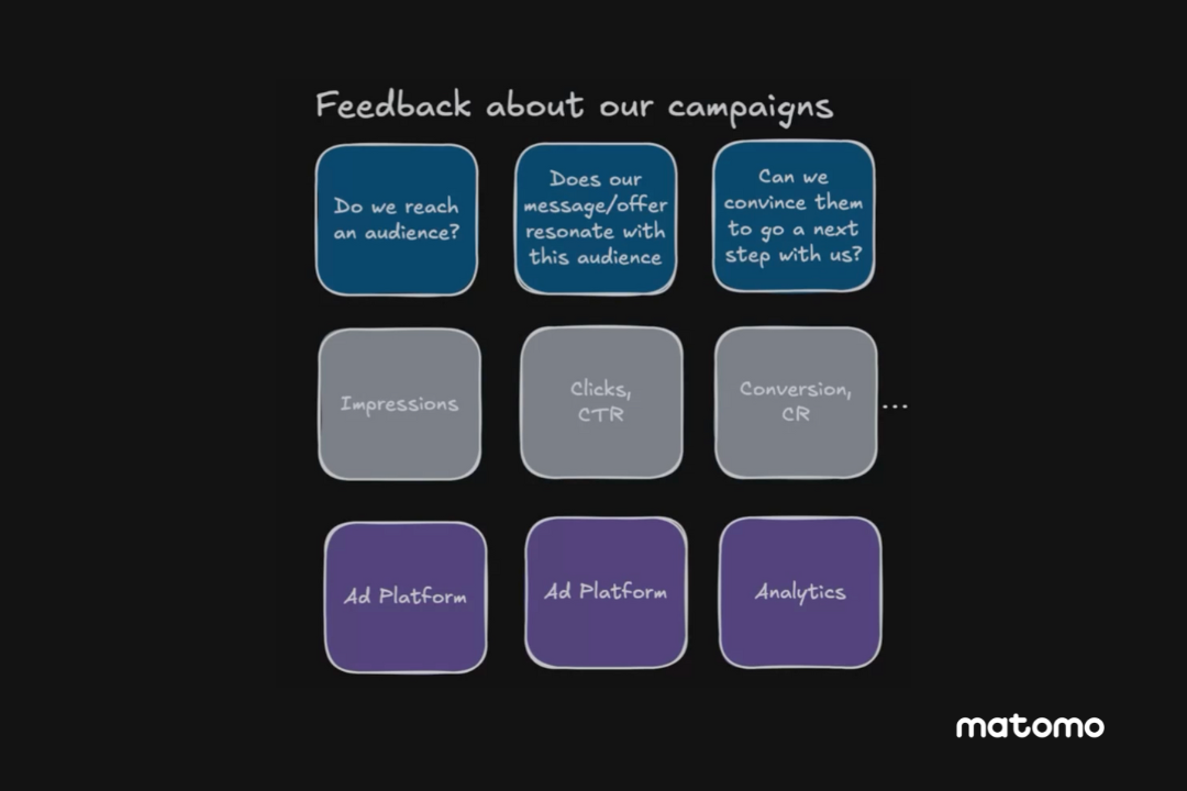
Unrestrained data collection leads to data bloat
Marketing and the business world are experiencing a data problem. Analysts and business intelligence teams grapple with large amounts of data that aren’t always useful and are often incomplete. The idea that “more data is better” became a guiding principle in the early 2000s, encouraging companies to gather everything possible using all available data collection methods. This unrestrained pursuit often led to an unexpected problem: data bloat. Too much data, too little clarity. Digital marketers, analysts, and business leaders now try to navigate vast amounts of information that create more confusion than insight, especially when the data is incomplete due to privacy regulations.

Cutting through the noise, focusing on what matters
The “more data is better” mindset emerged when digital marketers were beginning to understand data’s potential. It seemed logical: more data should mean more opportunities to optimise, personalise, and drive results. But in practice, gathering every possible piece of data often leads to a cluttered, confusing pile of metrics that can mislead more than guide.
This approach carries hidden costs. Excessive data collection burns resources, increases privacy concerns, and leaves teams unfocused. It’s easy to get lost trying to make sense of endless dashboards, metrics, and reports. More data doesn’t necessarily lead to better decisions; it often just leads to more noise, hindering effective data management.
Rethinking data management: From data overload to data mindfulness
Data management has often prioritised comprehensive data gathering without considering the specific value of each data point. This approach has created more information, but not necessarily better insights.
Data mindfulness is about taking a deliberate, focused approach to data collection and analysis. Instead of trying to collect everything, it emphasises gathering only what truly adds value. It’s about ensuring the data you collect serves a purpose and directly contributes to better insights and data-driven decision-making.
Think of it like applying a “lean” methodology to data—trimming away the unnecessary and keeping only what is essential. Or consider embracing data minimalism to declutter your data warehouse, keeping only what truly sparks insight.

Mindful data is ethical data
Adopting a mindful approach to data can pay off in several ways:
Reduces overwhelm: When you reduce the clutter, you’re left with fewer, clearer metrics that lead to stronger decisions and actionable data insights.
Mitigates compliance risks: By collecting less, companies align better with privacy regulations and build trust with their customers. Privacy-first analytics and privacy-compliant analytics practices mean there’s no need for invasive tracking if it doesn’t add value—and customers will appreciate that.
Enhances data ethics: Focusing on the quality rather than the quantity of data collected ensures ethical data collection and management. Companies use data responsibly, respect user privacy, and minimise unnecessary data handling, strengthening customer relationships and brand integrity.
Improves data efficiency: Focused analytics means better use of resources. You’re spending less time managing meaningless metrics and more time working on meaningful insights. Many companies have found success by switching to a leaner, quality-first data approach, reporting sharper, more impactful results.
Shifting towards simplicity and lean analytics
If data mindfulness sounds appealing, here’s how you can get started:
Ask the right questions. Before collecting any data, ask yourself: Why are we collecting this? How will it drive value? If you can’t answer these questions clearly, that data probably isn’t worth collecting. This is a key step in smart data management.
Simplify metrics. Focus on the KPIs that truly matter for your business. Choose a handful of key metrics that reflect your goals rather than a sprawling list of nice-to-haves. Embracing data simplicity helps in targeting data collection effectively.
Audit your current data. Review your existing data collection processes. Which metrics are you actively using to make decisions? Eliminate any redundant or low-value metrics that create noise. Use ethical data management practices to ensure data efficiency and compliance. Understanding what is data management in this context is crucial.
Implement lean analytics practices. Shift towards lean analytics by cutting down on unnecessary tracking. This can involve reducing reliance on multiple tracking scripts, simplifying your reporting, and setting up a streamlined dashboard focused on key outcomes. Embrace data reduction strategies to eliminate waste and boost effectiveness.
Who should watch this bootcamp
This bootcamp is perfect for data analysts, product managers, digital marketers and business leaders who are seeking a more streamlined approach to data measurement. If you’re interested in moving away from a chaotic “track-it-all” mentality and towards a focused, lean, and privacy-first analytics strategy, this workshop is for you.
What you’ll discover
Practical steps: Learn actionable strategies to reduce data bloat and implement lean, privacy-first analytics in your organisation.
Real-life examples: Explore case studies of companies that have successfully adopted focused and privacy-first analytics.
Deep insights: Gain a deeper understanding of how to prioritise quality over quantity without sacrificing valuable insights.
Watch the bootcamp on-demand
For a comprehensive dive into these topics, watch the full workshop video or download the detailed transcript. Equip yourself with the knowledge and tools to transform your data management approach today.
<script>

gform.initializeOnLoaded( function() {gformInitSpinner( 72, 'https://matomo.org/wp-content/plugins/gravityforms/images/spinner.svg', true );jQuery('#gform_ajax_frame_72').on('load',function(){var contents = jQuery(this).contents().find('*').html();var is_postback = contents.indexOf('GF_AJAX_POSTBACK') >= 0;if(!is_postback){return;}var form_content = jQuery(this).contents().find('#gform_wrapper_72');var is_confirmation = jQuery(this).contents().find('#gform_confirmation_wrapper_72').length > 0;var is_redirect = contents.indexOf('gformRedirect(){') >= 0;var is_form = form_content.length > 0 && ! is_redirect && ! is_confirmation;var mt = parseInt(jQuery('html').css('margin-top'), 10) + parseInt(jQuery('body').css('margin-top'), 10) + 100;if(is_form){jQuery('#gform_wrapper_72').html(form_content.html());if(form_content.hasClass('gform_validation_error')){jQuery('#gform_wrapper_72').addClass('gform_validation_error');} else {jQuery('#gform_wrapper_72').removeClass('gform_validation_error');}setTimeout( function() { /* delay the scroll by 50 milliseconds to fix a bug in chrome */  }, 50 );if(window['gformInitDatepicker']) {gformInitDatepicker();}if(window['gformInitPriceFields']) {gformInitPriceFields();}var current_page = jQuery('#gform_source_page_number_72').val();gformInitSpinner( 72, 'https://matomo.org/wp-content/plugins/gravityforms/images/spinner.svg', true );jQuery(document).trigger('gform_page_loaded', [72, current_page]);window['gf_submitting_72'] = false;}else if(!is_redirect){var confirmation_content = jQuery(this).contents().find('.GF_AJAX_POSTBACK').html();if(!confirmation_content){confirmation_content = contents;}setTimeout(function(){jQuery('#gform_wrapper_72').replaceWith(confirmation_content);jQuery(document).trigger('gform_confirmation_loaded', [72]);window['gf_submitting_72'] = false;wp.a11y.speak(jQuery('#gform_confirmation_message_72').text());}, 50);}else{jQuery('#gform_72').append(contents);if(window['gformRedirect']) {gformRedirect();}}jQuery(document).trigger("gform_pre_post_render", [{ formId: "72", currentPage: "current_page", abort: function() { this.preventDefault(); } }]);                if (event.defaultPrevented) {                return;         }        const gformWrapperDiv = document.getElementById( "gform_wrapper_72" );        if ( gformWrapperDiv ) {            const visibilitySpan = document.createElement( "span" );            visibilitySpan.id = "gform_visibility_test_72";            gformWrapperDiv.insertAdjacentElement( "afterend", visibilitySpan );        }        const visibilityTestDiv = document.getElementById( "gform_visibility_test_72" );        let postRenderFired = false;                function triggerPostRender() {            if ( postRenderFired ) {                return;            }            postRenderFired = true;            jQuery( document ).trigger( 'gform_post_render', [72, current_page] );            gform.utils.trigger( { event: 'gform/postRender', native: false, data: { formId: 72, currentPage: current_page } } );            if ( visibilityTestDiv ) {                visibilityTestDiv.parentNode.removeChild( visibilityTestDiv );            }        }        function debounce( func, wait, immediate ) {            var timeout;            return function() {                var context = this, args = arguments;                var later = function() {                    timeout = null;                    if ( !immediate ) func.apply( context, args );                };                var callNow = immediate && !timeout;                clearTimeout( timeout );                timeout = setTimeout( later, wait );                if ( callNow ) func.apply( context, args );            };        }        const debouncedTriggerPostRender = debounce( function() {            triggerPostRender();        }, 200 );        if ( visibilityTestDiv && visibilityTestDiv.offsetParent === null ) {            const observer = new MutationObserver( ( mutations ) => {                mutations.forEach( ( mutation ) => {                    if ( mutation.type === 'attributes' && visibilityTestDiv.offsetParent !== null ) {                        debouncedTriggerPostRender();                        observer.disconnect();                    }                });            });            observer.observe( document.body, {                attributes: true,                childList: false,                subtree: true,                attributeFilter: [ 'style', 'class' ],            });        } else {            triggerPostRender();        }    } );} );

</script> -
Four Trends Shaping the Future of Analytics in Banking
27 novembre 2024, par Daniel Crough — Banking and Financial ServicesWhile retail banking revenues have been growing in recent years, trends like rising financial crimes and capital required for generative AI and ML tech pose significant risks and increase operating costs across the financial industry, according to McKinsey’s State of Retail Banking report.
Today’s financial institutions are focused on harnessing AI and advanced analytics to make their data work for them. To be up to the task, analytics solutions must allow banks to give consumers the convenient, personalised experiences they want while respecting their privacy.
In this article, we’ll explore some of the big trends shaping the future of analytics in banking and finance. We’ll also look at how banks use data and technology to cut costs and personalise customer experiences.
So, let’s get into it.
This doesn’t just represent a security risk, it also impacts the usability for both customers and employees. Does any of the following sound familiar?
- Only specific senior employees know how to navigate the software to generate custom reports or use its more advanced features.
- Customer complaints about your site’s usability or online banking experience are routine.
- Onboarding employees takes much longer than necessary because of convoluted systems.
- Teams and departments experience ‘data siloing,’ meaning that not everyone can access the data they need.
These are warning signs that IT systems are ready for a review. Anyone thinking, “If it’s not broken, why fix it?” should consider that legacy systems can also present data security risks. As more countries introduce regulations to protect customer privacy, staying ahead of the curve is increasingly important to avoid penalties and litigation.
And regulations aren’t the only trends impacting the future of financial institutions’ IT and analytics.
4 trends shaping the future of analytics in banking
New regulations and new technology have changed the landscape of analytics in banking.
New privacy regulations impact banks globally
The first major international example was the advent of GDPR, which went into effect in the EU in 2018. But a lot has happened since. New privacy regulations and restrictions around AI continue to roll out.
- The European Artificial Intelligence Act (EU AI Act), which was held up as the world’s first comprehensive legislation on AI, took effect on 31 July 2024.
- In Europe’s federated data initiative, Gaia-X’s planned cloud infrastructure will provide for more secure, transparent, and trustworthy data storage and processing.
- The revised Payment Services Directive (PSD2) makes payments more secure and strengthens protections for European businesses and consumers, aiming to create a more integrated and efficient payments market.
But even businesses that don’t have customers in Europe aren’t safe. Consumer privacy is a hot-button issue globally.
For example, the California Consumer Privacy Act (CCPA), which took effect in January, impacts the financial services industry more than any other. Case in point, 34% of CCPA-related cases filed in 2022 were related to the financial sector.
California’s privacy regulations were the first in the US, but other states are following closely behind. On 1 July 2024, new privacy laws went into effect in Florida, Oregon, and Texas, giving people more control over their data.

One typical issue for companies in the banking industry is that their privacy measures regarding user data collected from their website are much less lax than those in their online banking system.
It’s better to proactively invest in a privacy-centric analytics platform before you get tangled up in a lawsuit and have to pay a fine (and are forced to change your system anyway).
And regulatory compliance isn’t the only bonus of an ethical analytics solution. The right alternative can unlock key customer insights that can help you improve the user experience.
The demand for personalised banking services
At the same time, consumers are expecting a more and more streamlined personal experience from financial institutions. 86% of bank employees say personalisation is a clear priority for the company. But 63% described resources as limited or only available after demonstrating clear business cases.
McKinsey’s The data and analytics edge in corporate and commercial banking points out how advanced analytics are empowering frontline bank employees to give customers more personalised experiences at every stage:
- Pre-meeting/meeting prep: Using advanced analytics to assess customer potential, recommend products, and identify prospects who are most likely to convert
- Meetings/negotiation: Applying advanced models to support price negotiations, what-if scenarios and price multiple products simultaneously
- Post-meeting/tracking: Using advanced models to identify behaviours that lead to high performance and improve forecast accuracy and sales execution
Today’s banks must deliver the personalisation that drives customer satisfaction and engagement to outperform their competitors.
The rise of AI and its role in banking
With AI and machine learning technologies becoming more powerful and accessible, financial institutions around the world are already reaping the rewards.
McKinsey estimates that AI in banking could add $200 to 340 billion annually across the global banking sector through productivity gains.
- Credit card fraud prevention: Algorithms analyse usage to flag and block fraudulent transactions.
- More accurate forecasting: AI-based tools can analyse a broader spectrum of data points and forecast more accurately.
- Better risk assessment and modelling: More advanced analytics and predictive models help avoid extending credit to high-risk customers.
- Predictive analytics: Help spot clients most likely to churn
- Gen-AI assistants: Instantly analyse customer profiles and apply predictive models to suggest the next best actions.
Considering these market trends, let’s discuss how you can move your bank into the future.
Using analytics to minimise risk and establish a competitive edge
With the right approach, you can leverage analytics and AI to help future-proof your bank against changing customer expectations, increased fraud, and new regulations.
Use machine learning to prevent fraud
Every year, more consumers are victims of credit and debit card fraud. Debit card skimming cases nearly doubled in the US in 2023. The last thing you want as a bank is to put your customer in a situation where a criminal has spent their money.
This not only leads to a horrible customer experience but also creates a lot of internal work and additional costs.Thankfully, machine learning can help identify suspicious activity and stop transactions before they go through. For example, Mastercard’s fraud prevention model has improved fraud detection rates by 20–300%.

Implementing a solution like this (or partnering with credit card companies who use it) may be a way to reduce risk and improve customer trust.
Foresee and avoid future issues with AI-powered risk management
Regardless of what type of financial products organisations offer, AI can be an enormous tool. Here are just a few ways in which it can mitigate financial risk in the future:
- Predictive analytics can evaluate risk exposure and allow for more informed decisions about whether to approve commercial loan applications.
- With better credit risk modelling, banks can avoid extending personal loans to customers most likely to default.
- Investment banks (or individual traders or financial analysts) can use AI- and ML-based systems to monitor market and trading activity more effectively.
Those are just a few examples that barely scratch the surface. Many other AI-based applications and analytics use cases exist across all industries and market segments.
Protect customer privacy while still getting detailed analytics
New regulations and increasing consumer privacy concerns don’t mean banks and financial institutions should forego website analytics altogether. Its insights into performance and customer behaviour are simply too valuable. And without customer interaction data, you’ll only know something’s wrong if someone complains.
Fortunately, it doesn’t have to be one or the other. The right financial analytics solution can give you the data and insights needed without compromising privacy while complying with regulations like GDPR and CCPA.
That way, you can track usage patterns and improve site performance and content quality based on accurate data — without compromising privacy. Reliable, precise analytics are crucial for any bank that’s serious about user experience.
Use A/B testing and other tools to improve digital customer experiences
Personalised digital experiences can be key differentiators in banking and finance when done well. But there’s stiff competition. In 2023, 40% of bank customers rated their bank’s online and mobile experience as excellent.
Improving digital experiences for users while respecting their privacy means going above and beyond a basic web analytics tool like Google Analytics. Invest in a platform with features like A/B tests and user session analysis for deeper insights into user behaviour.

Behavioural analytics are crucial to understanding customer interactions. By identifying points of friction and drop-off points, you can make digital experiences smoother and more engaging.
Matomo offers all this and is a great GDPR-compliant alternative to Google Analytics for banks and financial institutions.
Of course, this can be challenging. This is why taking an ethical and privacy-centric approach to analytics can be a key competitive edge for banks. Prioritising data security and privacy will attract other like-minded, ethically conscious consumers and boost customer loyalty.
Get privacy-friendly web analytics suitable for banking & finance with Matomo
Improving digital experiences for today’s customers requires a solid web analytics platform that prioritises data privacy and accurate analytics. And choosing the wrong one could even mean ending up in legal trouble or scrambling to reconstruct your entire analytics setup.
Matomo provides privacy-friendly analytics with 100% data accuracy (no sampling), advanced privacy controls and the ability to run A/B tests and user session analysis within the same platform (limiting risk and minimising costs).
It’s easy to get started with Matomo. Users can access clear, easy-to-understand metrics and plenty of pre-made reports that deliver valuable insights from day one. Form usage reports can help banks and fintechs identify potential issues with broken links or technical glitches and reveal clues on improving UX in the short term.
Over one million websites, including some of the world’s top banks and financial institutions, use Matomo for their analytics.
Start your 21-day free trial to see why, or book a demo with one of our analytics experts.