Recherche avancée
Médias (2)
-

SPIP - plugins - embed code - Exemple
2 septembre 2013, par
Mis à jour : Septembre 2013
Langue : français
Type : Image
-

Publier une image simplement
13 avril 2011, par ,
Mis à jour : Février 2012
Langue : français
Type : Video
Autres articles (87)
-
Emballe médias : à quoi cela sert ?
4 février 2011, parCe plugin vise à gérer des sites de mise en ligne de documents de tous types.
Il crée des "médias", à savoir : un "média" est un article au sens SPIP créé automatiquement lors du téléversement d’un document qu’il soit audio, vidéo, image ou textuel ; un seul document ne peut être lié à un article dit "média" ; -
Contribute to documentation
13 avril 2011Documentation is vital to the development of improved technical capabilities.
MediaSPIP welcomes documentation by users as well as developers - including : critique of existing features and functions articles contributed by developers, administrators, content producers and editors screenshots to illustrate the above translations of existing documentation into other languages
To contribute, register to the project users’ mailing (...) -
Configuration spécifique pour PHP5
4 février 2011, parPHP5 est obligatoire, vous pouvez l’installer en suivant ce tutoriel spécifique.
Il est recommandé dans un premier temps de désactiver le safe_mode, cependant, s’il est correctement configuré et que les binaires nécessaires sont accessibles, MediaSPIP devrait fonctionner correctement avec le safe_mode activé.
Modules spécifiques
Il est nécessaire d’installer certains modules PHP spécifiques, via le gestionnaire de paquet de votre distribution ou manuellement : php5-mysql pour la connectivité avec la (...)
Sur d’autres sites (4764)
-
AccessViolationException occurred in AForge.Video.FFMPEG.dll
4 août 2018, par Prakash MI have a camera class, in this class I used a timer and in its tick event I am saving video using
AForge.Net’s VideoFileWriter in C++/Cli (x86, .net framework : v4.6).
This is not supposed to happen, as this is managed code. But even if I wrap in try catch block, program crashes because ofAccessViolationException. I have verified that Image is not null. Something to do withVideoFileWriter. This happens anytime between app start to 30 minutes of running.An unhandled exception of type ’System.AccessViolationException’
occurred in AForge.Video.FFMPEG.dll
Additional information : Attempted to read or write protected memory.
This is often an indication that other memory is corrupt.In Visual Studio’s output I see
Exception thrown at 0x0C4D689F (swscale-2.dll) in test.exe : 0xC0000005 : Access violation writing location 0x09F83D80.
Exception thrown : ’System.AccessViolationException’ in
AForge.Video.FFMPEG.dllcode :
 private: System::Void Video_Recorder_Tick(System::Object^  sender, System::Timers::ElapsedEventArgs^  e)

  {

      Bitmap^ save = ConvertMatToBitmap(image); //function to convert opencv's Mat to .net's Bitmap

      if(writer!= nullptr)

       writer->WriteVideoFrame(save);

       delete save;

   }


  VideoFileWriter ^writer = gcnew VideoFileWriter();


  private: Void load_VideoWriter()

  {

    writer->Open("C:/video.avi", 640, 480, 10, VideoCodec::Default);

  }
Visual Studio showed few values for
writerBitRate 400000
Codec Default
FrameRate 10
Height 480
IsOpen true
Width 640Let me know if anybody needs more info.
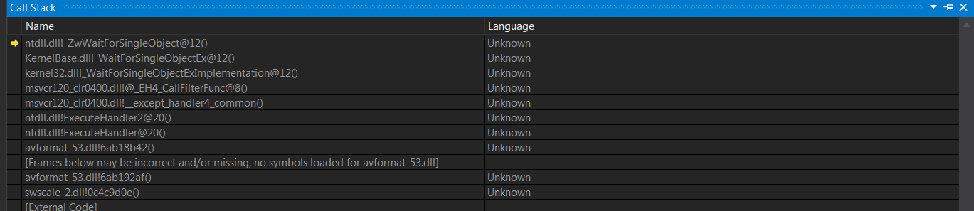
call stack didn’t help much
To my surprise no one on internet is having this issue !
Code seems straight forward, what could possibly be the issue ? -
how to convert HLS to RTMP with DISCONTINUITY tag
21 août 2018, par bekks8We have software that produces concatenated HLS files. This concatenation is basically just playlist manipulation. We replace some parts of the manifest by other parts. To make the HLS valid we add a #EXT-X-DISCONTINUITY tag before and after the change :
#EXTM3U

#EXT-X-VERSION:3

#EXT-X-TARGETDURATION:5

#EXT-X-MEDIA-SEQUENCE:0

#EXT-X-PLAYLIST-TYPE:VOD

#EXTINF:4.0000,

http://host/stream/1

#EXT-X-DISCONTINUITY

#EXTINF:4.0000,

http://host/stream/2

#EXTINF:4.0000,

http://host/stream/3

#EXTINF:4.0000,

http://host/stream/4

#EXTINF:4.0000,

http://host/stream/5

#EXTINF:4.0000,

http://host/stream/6

#EXTINF:0.2917,

http://host/stream/7

#EXT-X-DISCONTINUITY

#EXTINF:4.0000,

http://host/stream/8

#EXT-X-ENDLIST
In an HTML5 player above manifest will play just fine. Everything is in sync, audio and video play.
Now, when i try and convert above to an rtmp format and stream this to a rtmp endpoint it works, but it stalls after about 4 seconds, than it continues missing 4 seconds, and runs fine after that.
Basically, it plays part 1, skips 2, and continues with 3.
I’ve checked the logs for ffmpeg which repeat :
[flv @ 0x7fa696837c00] Non-monotonous DTS in output stream 0:1; previous: 3924, current: 0; changing to 3924. This may result in incorrect timestamps in the output file.

[flv @ 0x7fa696837c00] Non-monotonous DTS in output stream 0:1; previous: 3924, current: 23; changing to 3924. This may result in incorrect timestamps in the output file.

[flv @ 0x7fa696837c00] Non-monotonous DTS in output stream 0:1; previous: 3924, current: 46; changing to 3924. This may result in incorrect timestamps in the output file.
After the DTS warnings ffmpeg reports that it dropped 95 frames :
frame= 102 fps= 22 q=28.0 size= 181kB time=00:00:04.34 bitrate= 341.7kbits/s dup=0 drop=95 speed=0.958xThis of course makes, sense, when i check with ffprobe i can see that the PTS isn’t aligned (which is expected) :
frame|pkt_pts_time=5.316667|pkt_dts_time=5.316667|pict_type=B

frame|pkt_pts_time=5.358333|pkt_dts_time=5.358333|pict_type=B

frame|pkt_pts_time=5.400000|pkt_dts_time=1.400000|pict_type=P

frame|pkt_pts_time=5.441667|pkt_dts_time=1.441667|pict_type=P

frame|pkt_pts_time=1.483333|pkt_dts_time=1.483333|pict_type=I

frame|pkt_pts_time=1.525000|pkt_dts_time=1.525000|pict_type=B

frame|pkt_pts_time=1.566667|pkt_dts_time=1.566667|pict_type=B
The 95frames, is exactly the number of frames with a PKT_PTS_TIME (and DTS) in the past.
the ffmpeg command i use to create the RTMP stream is :
ffmpeg -fflags +igndts -re -i http://host/manifest -c:v libx264 -force_key_frames "expr:gte(t,n_forced*2)" -c:a aac -ar 44100 -r 24 -f flv rtmp://domain/some/rtmp/endpointWhat i’m looking for is a way to convert the HLS to a valid RTMP, without it skipping the frames with a PTS in the past. I would like it to just regenerate the PTS :
Is there a way to tell ffmpeg to regenerate the PTS/DTS timestamps in it’s output file ? -
ffmpeg sync issue when muxing audio and video
25 août 2018, par tweecoreI have an issue with ffmpeg. I am not a pro user so I’m on a constant trial & error mode. I would need a little help from this community that helped me countless time before.
I downloaded separate audio and video segments of a video stream. Both audio and video were shown in the Network tab as being .m4s files, but the .m3u8 playlist gave me .ts files for both. So then I downloaded the whole audio batch and concatenated it into a single .ts file. I did the same with video, but using a .mp4 output.EDIT : When merging the audio .ts files, I encounter this issue :
[mpegts @ 0x7f88cb805600] Non-monotonous DTS in output stream 0:0;

previous: 1077120, current: 1073280; changing to 1077121. This may

result in incorrect timestamps in the output file.
UPDATE : Just noticed that when I examine the .ts audio file with MediaInfo, the frame rate is 41.667 fps (1152 SPF).
So now I have two files : a working single .ts with audio and a working single .mp4 with video.
Only when I tried to merge them, however, I noticed that audio and video resulted as out of sync.
This is because audio has a different length from video (don’t know why, they were the same amount of segments : 750).
Audio info :Input #0, mpegts, from 'output.ts':
Duration: 01:14:12.11, start: 1.400000, bitrate: 434 kb/s
Program 1
Metadata:
service_name : Service01
service_provider: FFmpeg
Stream #0:0[0x100]: Audio: mp2 ([3][0][0][0] / 0x0003), 48000 Hz, stereo, fltp, 384 kb/sI can see that for some reason, it starts at 1.4s.
Video info :
Input #0, mov,mp4,m4a,3gp,3g2,mj2, from 'output.mp4':

Metadata:

major_brand     : isom

minor_version   : 512

compatible_brands: isomiso2avc1mp41

encoder         : Lavf58.12.100

Duration: 01:14:57.84, start: 0.000000, bitrate: 2425 kb/s

Stream #0:0(und): Video: h264 (High) (avc1 / 0x31637661), yuv420p(tv, bt709), 1280x720 [SAR 1:1 DAR 16:9], 2423 kb/s, 25 fps, 25 tbr, 90k tbn, 50 tbc (default)

Metadata:

  handler_name    : VideoHandler
Video and audio are synced at the beginning (somehow the 1.4 start makes sense) but audio starts drifting and goes out of sync after a while. How do I solve the issue ?
 Syndiquer tout le site

